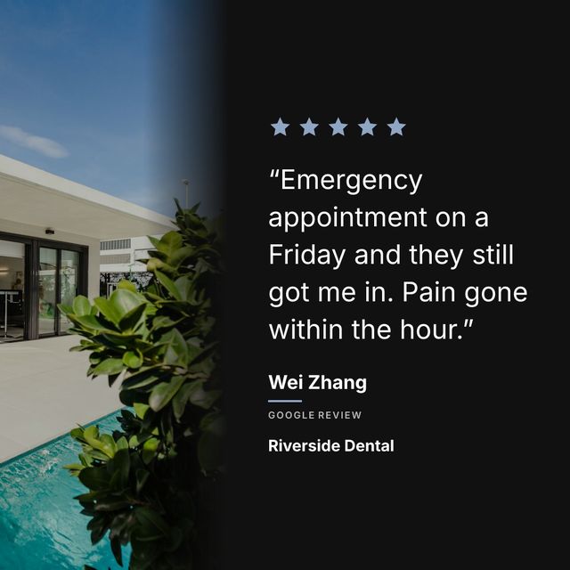
Most people looking for a review template are not looking for a template. They are looking for a way to end up with something that does not look homemade, without having to know what kerning is.
What actually makes a review post work:
- The quote is the biggest thing on it. Bigger than your logo, bigger than the stars.
- The stars sit near the top, where the eye lands first.
- Your name appears once, small, so the post is unmistakably yours.
- There is a photo behind the words, darkened enough that the text stays readable.
- The review says something specific. This matters more than all of the above.
None of that requires design skill. It requires knowing what to keep and what to leave out, which is most of what a template is doing for you anyway.
The quote is the whole post
The most common mistake is treating a review post like a company announcement. A big logo at the top, the review shrunk into the middle, a website address along the bottom.
Nobody stops scrolling for your logo. They stop for a sentence that sounds like a person. Give the quote most of the square and let everything else be small.
If the review is long, cut it to the strongest sentence or two rather than shrinking the type to fit. Never change the words themselves.
Pick the review before you think about the design
A specific review makes a good post almost regardless of how it is laid out. A generic one cannot be rescued by any amount of design.
“The chocolate croissant changed my morning routine” gives somebody a reason to visit. “Great bakery, friendly staff” does not, no matter how nicely it is set.
Go through your reviews and pick the ones that name a dish, a person, a result, or a moment. Those are your posts. Two good ones a month beat eight forgettable ones.
Photo, colour, and the one thing that goes wrong
A photograph behind the text makes a post look considered rather than generic. Your own photo beats a stock one, because a picture of your actual room is something no competitor has.
The thing that goes wrong is contrast. White text on a bright photo is unreadable, and it is unreadable in exactly the situation that matters, which is a phone held at arm’s length in daylight. Darken the photo behind the words until you can read them at a glance, then darken it slightly more.
If you have no photograph you are happy with, use a near-black background instead of a bright colour. It reads as deliberate.
Getting there without opening a design tool
If you want a file to edit, Canva has free testimonial templates. Search “Google review template” rather than “testimonial”, because the ones built for reviews already have a star row and an attribution line in the layout.
If you would rather not design anything at all, Prizz reads the reviews off your Google listing and renders the post. You choose an arrangement once and every review afterwards comes out in it, with the quote already sized, the stars placed and the photo darkened to the point where the words are readable.
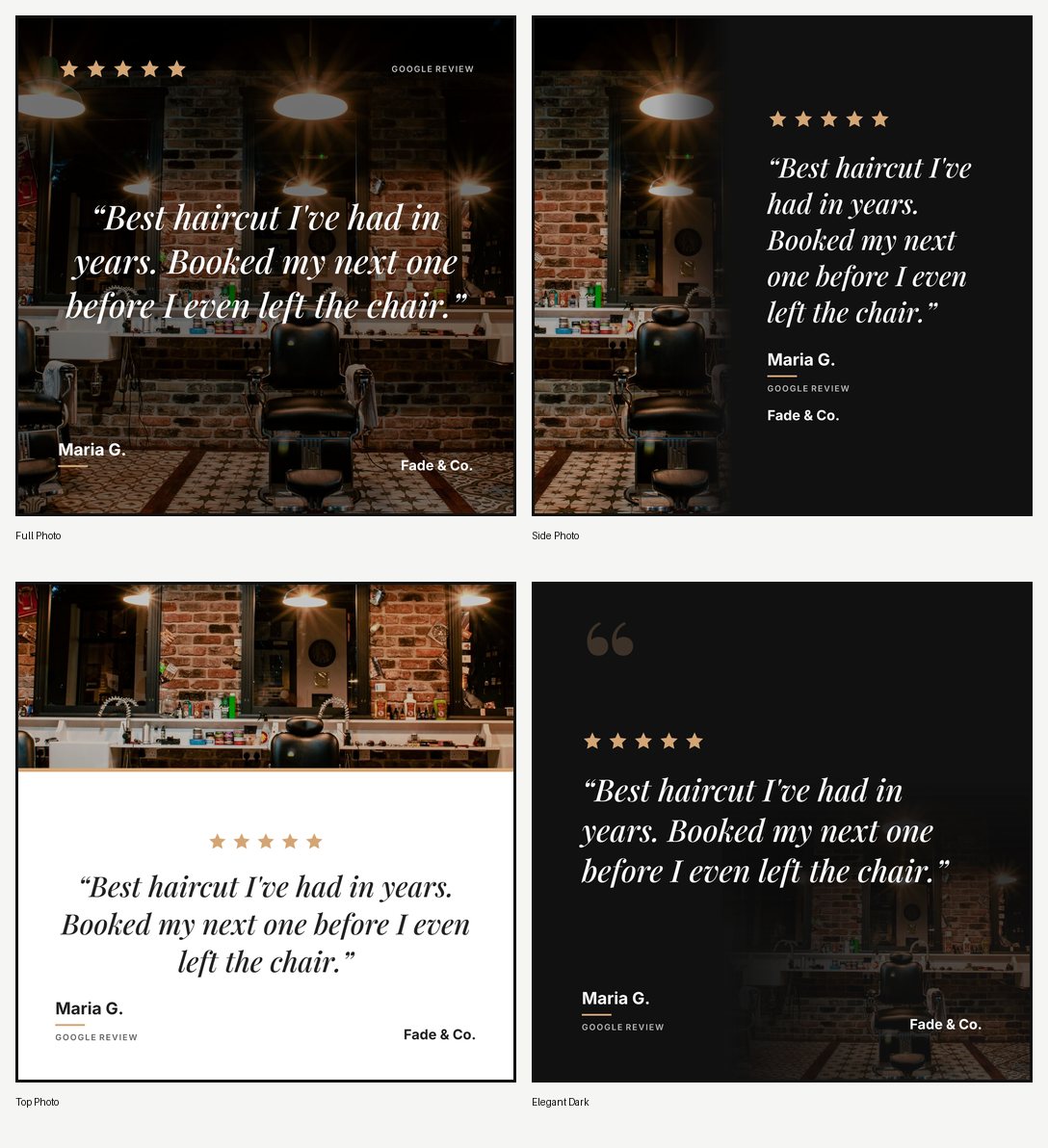
Those are outputs rather than files you edit. Three posts a month are free, with no watermark and no card.
The test to run before you post
Look at it on your phone, at arm’s length, for two seconds. That is roughly how long it gets in a feed.
If you can read the quote and see the stars in those two seconds, it works. If you had to lean in, the type is too small or the background is too bright, and no template will fix either of those for you.